codecamp

Bootstrap的响应式表格

通过把任意的 .table 包在 .table-responsive class 内,您可以让表格水平滚动以适应小型设备(小于 768px)。当在大于 768px 宽的大型设备上查看时,您将看不到任何的差别。
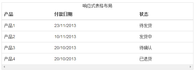

代码如下:

<div class="table-responsive"> 
    <table class="table"> 
        <caption>响应式表格布局</caption> 
        <thead> 
            <tr> 
                <th>产品</th> 
                <th>付款日期</th> 
                <th>状态</th></tr> 
        </thead> 
        <tbody> 
            <tr> 
                <td>产品1</td> 
                <td>23/11/2013</td> 
                <td>待发货</td></tr> 
            <tr> 
                <td>产品2</td> 
                <td>10/11/2013</td> 
                <td>发货中</td></tr> 
            <tr> 
                <td>产品3</td> 
                <td>20/10/2013</td> 
                <td>待确认</td></tr> 
            <tr> 
                <td>产品4</td> 
                <td>20/10/2013</td> 
                <td>已退货</td></tr> 
        </tbody> 
    </table> 
</div>

结果如下所示:

Bootstrap的响应式表格

Bootstrap的紧凑型表格
Bootstrap的有序列表和无序列表
温馨提示
下载编程狮App,免费阅读超1000+编程语言教程
取消
确定
目录

关闭

MIP.setData({ 'pageTheme' : getCookie('pageTheme') || {'day':true, 'night':false}, 'pageFontSize' : getCookie('pageFontSize') || 20 }); MIP.watch('pageTheme', function(newValue){ setCookie('pageTheme', JSON.stringify(newValue)) }); MIP.watch('pageFontSize', function(newValue){ setCookie('pageFontSize', newValue) }); function setCookie(name, value){ var days = 1; var exp = new Date(); exp.setTime(exp.getTime() + days*24*60*60*1000); document.cookie = name + '=' + value + ';expires=' + exp.toUTCString(); } function getCookie(name){ var reg = new RegExp('(^| )' + name + '=([^;]*)(;|$)'); return document.cookie.match(reg) ? JSON.parse(document.cookie.match(reg)[2]) : null; }