
快应用 tabs教程
了解如何使用tabs组件完成选项卡页签的布局,灵活组合组件,配置属性,优化性能
通过本节,你将学会:
div组件模拟选项卡
选项卡效果常见于传统H5开发中,开发者一般使用div和js代码控制布局交互得以实现
在框架中,开发者也可以使用div组件实现简单的效果,示例代码如下:
<template>
  <div class="tutorial-page">
    <!-- div组件模拟选项卡功能 -->
    <div class="div-tabs">
      <!-- tabs的head部分 -->
      <div class="div-tabbar">
        <text onclick="showContent(1)">menu1</text>
        <text onclick="showContent(2)">menu2</text>
        <text onclick="showContent(3)">menu3</text>
      </div>
      <!-- tabs的body部分 -->
      <div class="div-tabcontent">
        <div class="div-tabcontent-section" show="{{type === 'content_1'}}">
          <text>content1</text>
        </div>
        <div class="div-tabcontent-section" show="{{type === 'content_2'}}">
          <text>content2</text>
        </div>
        <div class="div-tabcontent-section" show="{{type === 'content_3'}}">
          <text>content3</text>
        </div>
      </div>
    </div>
  </div>
</template>

<script>
  export default {
    data: {
      type: 'content_1'
    },
    showContent (num) {
      this.type =  'content_' + num;
    }
  }
</script>使用div组件实现的选项卡效果,功能还是有限,为了带来最佳用户体验,建议使用框架提供的tabs组件完成需求
使用tabs组件
tabs中封装了常见功能和效果:页签支持横向滚动,支持手势滑动切换内容页等
tabs内部仅支持子组件tab-bar和tab-content,也可以只包含一个子组件,使用说明如下:
tab-bar组件用来包含所有页签的标题,属性mode用来配置是否可滚动,详情请参考文档:组件 -> 容器组件 -> tab-bartab-content组件用来包含所有页签的内容,详情请参考文档:组件 -> 容器组件 -> tab-contenttab-bar组件的第n个直接子节点对应tab-content中第n个直接子节点,具有联动效果
示例代码如下:
<template>
  <div class="tutorial-page">
    <!-- tabs组件 -->
    <tabs>
      <tab-bar class="tab-bar">
        <text>menu1</text>
        <text>menu2</text>
        <text>menu3</text>
      </tab-bar>
      <tab-content class="tab-content">
        <div class="tab-content-section">
          <text>content1</text>
        </div>
        <div class="tab-content-section">
          <text>content2</text>
        </div>
        <div class="tab-content-section">
          <text>content3</text>
        </div>
      </tab-content>
    </tabs>
  </div>
</template>
注意:
tabs内不能再嵌套tabs,如有此类需求,请参考教程第一部分div组件模拟选项卡
页签内容使用自定义子组件
为了更好的组织页面代码,提升代码可维护性。开发者可以将页签内容通过自定义子组件来渲染
关于如何开发子组件请参考文档:父子组件通信 ,本小节仅做简单引入使用
示例代码如下:
<import name="tab-content-item" src="./tabitem"></import>

<template>
  <div class="tutorial-page">
    <tabs onchange="onChangeTabIndex">
      <tab-bar class="tab-bar">
        <text>menu1</text>
        <text>menu2</text>
        <text>menu3</text>
      </tab-bar>
      <tab-content class="tab-content">
        <tab-content-item index="0" itemdata="{{list[0]}}" current-index="{{currentIndex}}"></tab-content-item>
        <tab-content-item index="1" itemdata="{{list[1]}}" current-index="{{currentIndex}}"></tab-content-item>
        <tab-content-item index="2" itemdata="{{list[2]}}" current-index="{{currentIndex}}"></tab-content-item>
      </tab-content>
    </tabs>
  </div>
</template>

<script>
  export default {
    data: {
      list: [
        {title: "content1"},
        {title: "content2"},
        {title: "content3"}
      ],
      currentIndex: 0
    },
    onChangeTabIndex (evt) {
      this.currentIndex = evt.index
    }
  }
</script>在tabitem.ux文件中:
<template>
  <div class="tab-section">
    <text>{{itemdata.title}}</text>
  </div>
</template>
<style>
  .tab-section {
    flex: 1;
    flex-direction: column;
    justify-content: center;
    background-color: #ffffff;
    margin: 10px;
  }
  .tab-section text {
    color: #FF0000;
    text-align: center;
  }
</style>
<script>
  export default {
    props: [
      'index',
      'itemdata',
      // 驼峰式在赋值时使用-连接
      'currentIndex'
    ],
    onInit () {
      // 监听属性变化
      this.$watch('currentIndex', 'watchCurrentIndex')
    },
    /**
     * 监听用户选择的索引,选中当前时触发业务逻辑
     * @param newValue
     * @param oldValue
     */
    watchCurrentIndex (newValue, oldValue) {
      if (parseInt(this.index) === this.currentIndex) {
        console.info(`当前用户选择了这个标签:${this.index}, ${newValue}, ${oldValue}`)
      }
    }
  }
</script>
页签内容懒加载
一个内容丰富的选项卡,通常会包含许多页签内容。如新闻类应用中,可能会包括:推荐、热点、视频、段子、汽车、社会、娱乐等
直接使用tabs默认会加载所有页签内容,导致JS线程持续忙于渲染每个页签,无法响应用户点击事件等,造成体验困扰
为了解决这类问题,开发者可以让页签内容在用户点击时延迟渲染(而不是整个页面初始化时渲染),这项功能可以通过if指令完成
示例代码如下:
<template>
<div class="tutorial-page">
<tabs onchange="onChangeTabIndex">
<tab-bar class="tab-bar" mode="scrollable">
<text for="{{tabHeadList}}" class="{{currentIndex === $idx ? 'active' : ''}}" >{{$item.title}}</text>
</tab-bar>
<tab-content class="tab-content">
<div class="tab-content-section" for="{{tabHeadList}}">
<!-- 初始化时,if为false,默认不做渲染;点击后改为true -->
<text if="{{ renderTabContent($idx) }}">{{$item.title}}</text>
</div>
</tab-content>
</tabs>
</div>
</template>
<style lang="less">
.tutorial-page {
flex-direction: column;
justify-content: center;
align-items: center;
.tab-bar text{
padding: 0 25px;
text-align: center;
font-size: 34px;
}
.tab-bar .active {
color: #FF0000;
}
.tab-content {
flex: 1;
background-color: #eeeeee;
.tab-content-section {
flex: 1;
margin: 10px;
background-color: #ffffff;
justify-content: center;
text {
text-align: center;
color: #FF0000;
}
}
}
}
</style>
<script>
export default {
data: {
tabHeadList: [
{title: "推荐"},
{title: "热门"},
{title: "视频"},
{title: "段子"},
{title: "汽车"},
{title: "社会"},
{title: "娱乐"},
{title: "军事"},
{title: "体育"},
{title: "NBA"},
{title: "财经"}
],
currentIndex: 0
},
onInit(){
// 加载第一个页签内容
this.changeTabIndex(0)
},
changeTabIndex(index) {
const item = Object.assign({}, this.tabHeadList[index])
item.render = true
this.tabHeadList.splice(index, 1, item)
},
onChangeTabIndex (evt) {
this.currentIndex = evt.index
this.changeTabIndex(evt.index)
},
renderTabContent (index) {
return !!this.tabHeadList[index].render
}
}
</script>tabs仅包含tab-content
tabs内部可以仅包含tab-bar或者tab-content
假设开发者有如下需求:开发一个简化的社交主页,其中,用户图标和搜索图标为跳转按钮,点击跳转页面;聊天、发现、通讯录为页签,与内容页联动,效果如下:
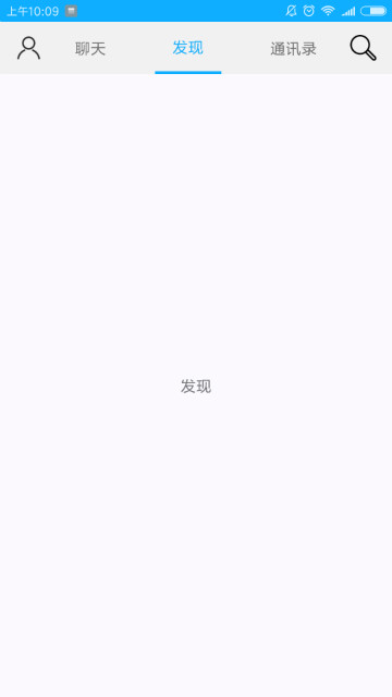
由于tabs仅支持子组件tab-bar与tab-content,且tab-bar与tab-content的直接子元素都被当做页签或内容页。因此,仅使用tabs无法实现两个图标按钮
所以开发者可以这样实现:
tabs中,仅使用tab-content,包含选项卡的所有内容页tabs外,使用div包含选项卡页签标题及图标按钮,模拟tab-bar- 在js代码中,动态绑定
tabs的index属性,监听tabs的change事件,实现页签与内容页的联动
示例代码如下:
<template>
<div class="tutorial-page">
<!-- 灵活使用tabs组件 -->
<div class="flexible-tabs">
<!-- 自定义tab-bar组件 -->
<div class="flexible-tabbar">
<image src="./img/user.png" onclick="routePage('personal')"></image>
<text class="{{currentIndex === 0 ? 'active' : ''}}" onclick="clickTabBar(0)">聊天</text>
<text class="{{currentIndex === 1 ? 'active' : ''}}" onclick="clickTabBar(1)">发现</text>
<text class="{{currentIndex === 2 ? 'active' : ''}}" onclick="clickTabBar(2)">通讯录</text>
<image src="./img/search.png" onclick="routePage('search')"></image>
</div>
<!-- 监听change事件,触发时动态修改tabs的index属性 -->
<tabs onchange="changeTabactive" index="{{currentIndex}}">
<tab-content class="flexible-tab-content">
<div class="tab-content-section">
<text>聊天</text>
</div>
<div class="tab-content-section">
<text>发现</text>
</div>
<div class="tab-content-section">
<text>通讯录</text>
</div>
</tab-content>
</tabs>
</div>
</div>
</template>
<style lang="less">
.tutorial-page {
flex: 1;
.flexible-tabs {
flex: 1;
flex-direction: column;
.flexible-tabbar {
height: 100px;
padding: 0 30px;
background-color: #f1f1f1;
align-items: center;
text {
flex-grow: 1;
height: 100px;
margin: 0 30px;
text-align: center;
border: 0px solid #f1f1f1;
border-bottom-width: 5px;
}
image {
height: 50px;
width: 50px;
resize-mode: contain;
}
.active {
color: #0faeff;
border-bottom-color: #0faeff;
}
}
.flexible-tab-content {
flex: 1;
.tab-content-section {
flex: 1;
background-color: #ffffff;
justify-content: center;
}
}
}
}
</style>
<script>
import router from '@system.router'
export default {
data: {
currentIndex: 0
},
changeTabactive (evt) {
this.currentIndex = evt.index
},
clickTabBar (index) {
this.currentIndex = index
},
routePage (param) {
router.push({
uri: param
})
}
}
</script>总结
选项卡需求很常见,熟悉tabs组件的使用,有助于:提升用户体验、减少加载时间、优化页面性能