
Element-React Switch 开关
表示两种相互对立的状态间的切换,多用于触发「开/关」。
基本用法
绑定value到一个Boolean类型的变量。可以使用onText属性与offText属性来设置开关的文字描述,使用onColor属性与offColor属性来设置开关的背景色。
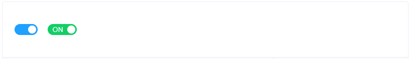
render() {
  return (
    <div>
      <Switch
        value={true}
        onText=""
        offText="">
      </Switch>
      <Switch
        value={true}
        onColor="#13ce66"
        offColor="#ff4949">
      </Switch>
    </div>
  )
}
扩展的 value 类型
设置onValue和offValue属性,接受Boolean, String或Number类型的值。
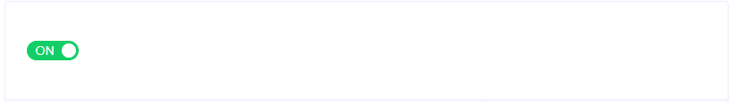
constructor(props) {
  super(props);


  this.state = {
    value: 100,
  }
}


render() {
  return (
    <Tooltip
      placement="top"
      content={
        <div>Switch value: {this.state.value}</div>
      }
    >
      <Switch
        value={this.state.value}
        onColor="#13ce66"
        offColor="#ff4949"
        onValue={100}
        offValue={0}
        onChange={(value)=>{this.setState({value: value})}}
       >
      </Switch>
    </Tooltip>
  )
}
禁用状态
设置disabled属性,接受一个Boolean,设置true即可禁用。
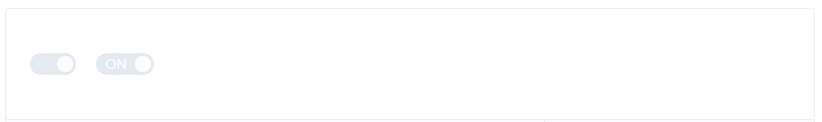
render() {
  return (
    <div>
      <Switch
        value={true}
        onText=""
        offText=""
        disabled>
      </Switch>
      <Switch
        value={true}
        disabled>
      </Switch>
    </div>
  )
}
焦点
设置allowFocus属性,接受一个Boolean,设置true即可激活。
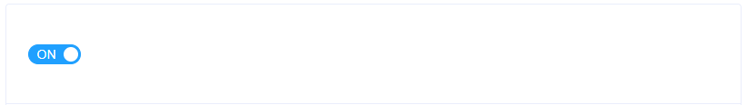
render() {
  return (
    <div>
      <Switch
        allowFocus={true}
        onFocus={()=>console.log('focus')}
        onBlur={()=>console.log('blur')}
        >
      </Switch>
    </div>
  )
}
Attributes
| 参数 | 说明 | 类型 | 可选值 | 默认值 |
|---|---|---|---|---|
| disabled | 是否禁用 | boolean | — | false |
| width | switch 的宽度(像素) | number | — | 58(有文字)/ 46(无文字) |
| onIconClass | switch 打开时所显示图标的类名, 设置此项会忽略 onText |
string | — | — |
| offIconClass | switch 关闭时所显示图标的类名, 设置此项会忽略 offText |
string | — | — |
| onText | switch 打开时的文字 | string | — | ON |
| offText | switch 关闭时的文字 | string | — | OFF |
| onValue | switch 打开时的值 | boolean / string / number | — | true |
| offValue | switch 关闭时的值 | boolean / string / number | — | false |
| onColor | switch 打开时的背景色 | string | — | #20A0FF |
| offColor | switch 关闭时的背景色 | string | — | #C0CCDA |
| name | switch 对应的 name 属性 | string | — | — |
| allowFocus | 允许 switch 触发 focus 和 blur 事件 | boolean | boolean | — |
Events
| 事件名称 | 说明 | 回调参数 |
|---|---|---|
| onChange | switch 状态发生变化时的回调函数 | value |
| onBlur | switch 失去焦点时触发,仅当 allow-focus 为 true 时生效 |
event: Event |
| onFocus | switch 获得焦点时触发,仅当 allow-focus 为 true 时生效 |
event: Event |