Materialize 多媒体
Materialize有几个类,以使图像和视频响应不同的大小。
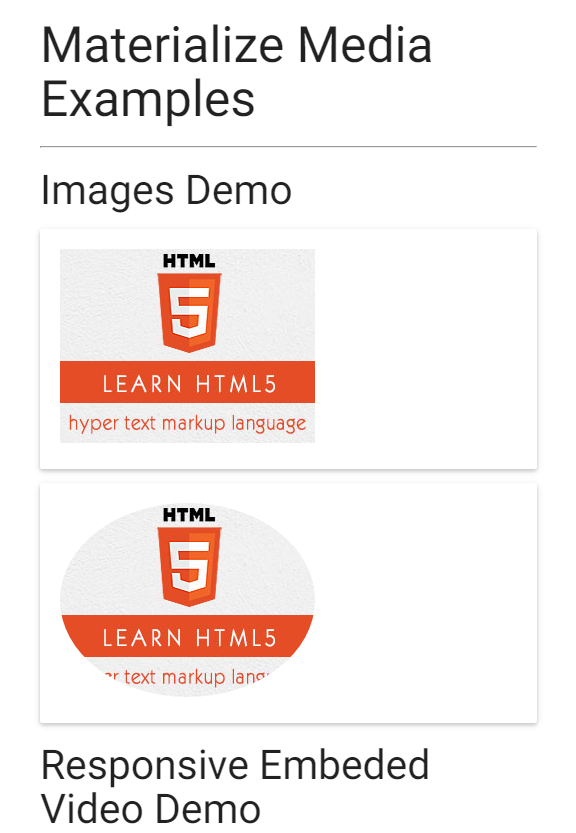
responsive-img -它使图像基于屏幕大小自行调整大小。
video-container -对于具有嵌入视频的响应容器
responsive-video -使HTML5视频具有响应性。
例子
materialize_media.html
<!DOCTYPE html>
<html>
   <head>
      <title>The Materialize Example</title>
	  <meta name="viewport" content="width=device-width, initial-scale=1">
	  <link rel="stylesheet" href="https://fonts.googleapis.com/icon?family=Material+Icons">
	  <link rel="stylesheet" href="https://cdnjs.cloudflare.com/ajax/libs/materialize/0.97.3/css/materialize.min.css">
      <script type="text/javascript" src="/attachments/tuploads/materialize/jquery-2.1.1.min.js"></script>
      <script src="/attachments/tuploads/materialize/materialize.min.js"></script>
   </head>
   <body class="container">
      <h2>Materialize Media Examples</h2>
      <hr/>
      <h3>Images Demo</h3>
      <div class="card-panel">
         <img src="html5-mini-logo.jpg" alt="" class="responsive-img">
      </div>
      <div class="card-panel">
         <img src="html5-mini-logo.jpg" alt="" class="circle responsive-img">
      </div>
      <h3>Responsive Embeded Video Demo</h3>
      <div class="video-container">
         <iframe width="540" height="200" src="/attachments/tuploads/materialize/Q8TXgCzxEnw?rel=0" frameborder="0" allowfullscreen></iframe>
      </div>
      <div class="video-container">
         <video  width="300" height="200" controls autoplay>
            <source src="/attachments/tuploads/materialize/foo.ogg" type="video/ogg" />
            <source src="/attachments/tuploads/materialize/foo.mp4" type="video/mp4" />
            Your browser does not support the video element.
         </video>
      </div>
   </body>
</html>
结果
验证结果,如下图所示。