
焦点事件
基本概念
- 焦点
指向当前应用界面上唯一的一个可交互元素,当用户使用键盘、电视遥控器、车机摇杆/旋钮等非指向性输入设备与应用程序进行间接交互时,基于焦点的导航和交互是重要的输入手段。
- 默认焦点
应用打开或切换页面后,若当前页上存在可获焦的组件,则树形结构的组件树中第一个可获焦的组件默认获得焦点。可以使用自定义默认焦点进行自定义指定。
- 获焦
指组件获得了焦点,同一时刻,应用中最多只有1个末端组件是获焦的,且此时它的所有祖宗组件(整个组件链)均是获焦的。当期望某个组件获焦,须确保该组件及其所有的祖宗节点均是可获焦的(focusable属性为true)。
- 失焦
指组件从获焦状态变成了非获焦状态,失去了焦点。组件失焦时,它的所有祖宗组件(失焦组件链)与新的获焦组件链不相同的节点都会失焦。
- 走焦
表示焦点在当前应用中转移的过程,走焦会带来原焦点组件的失焦和新焦点组件的获焦。应用中焦点发生变化的方式按行为可分为两类:
- 主动走焦:指开发者/用户主观的行为导致焦点移动,包含:外接键盘上按下TAB/方向键、使用requestFocus主动给指定组件申请焦点、组件focusOnTouch属性为true后点击组件。
- 被动走焦:指组件焦点因其他操作被动的转移焦点,此特性为焦点系统默认行为,无法由开发者自由设定,例如当使用if-else语句将处于获焦的组件删除/将处于获焦的组件(或其父组件)置成不可获焦时、当页面切换时。
- 焦点态
获焦组件的样式,不同组件的焦点态样式大同小异,默认情况下焦点态不显示,仅使用外接键盘按下TAB键/方向键时才会触发焦点态样式出现。首次触发焦点态显示的TAB键/方向键不会触发走焦。当应用接收到点击事件时(包括手指触屏的按下事件和鼠标左键的按下事件),自动隐藏焦点态样式。焦点态样式由后端组件定义,开发者无法修改。
走焦规则
走焦规则是指用户使用“TAB键/SHIFT+TAB键/方向键”主动进行走焦,或焦点系统在执行被动走焦时的顺序规则。组件的走焦规则默认由走焦系统定义,由焦点所在的容器决定。
- 线性走焦:常见的容器有Flex、Row、Column、List,这些都是典型的单方向容器,组件在这些容器内的排列都是线性的,那么走焦规则也是线性的。走焦的方向和方向键的方向一致。图1 线性走焦示意图
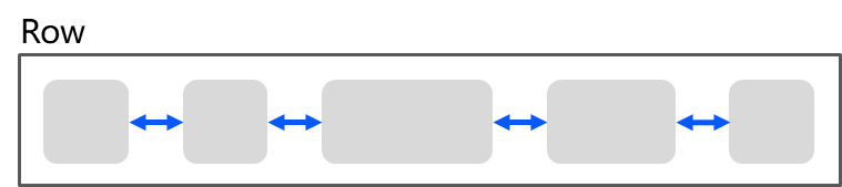
例如Row容器,使用方向键左右(←/→)即可将焦点在相邻的2个可获焦组件之间来回切换。
- 十字走焦:使用方向键上(↑)下(↓)左(←)右(→)可以使焦点在相邻的组件上切换。典型的是Grid容器,如下图:图2 Grid组件十字走焦示意图
 说明
说明- TAB/SHIFT+TAB键在以上两种走焦规则上的功能和方向键一致。TAB键等同于“先执行方向键右,若无法走焦,再执行方向键下”,SHIFT+TAB键等同于“先执行方向键左,若无法走焦,再执行方向键上”。
- 触发走焦的按键是按下的事件(DOWN事件)。
- 删除组件、设置组件无法获焦后,会使用线性走焦规则,自动先往被删除/Unfocusable组件的前置兄弟组件上走焦,无法走焦的话,再往后置兄弟组件上走焦。
- tabIndex走焦:给组件设置tabIndex通用属性,自定义组件的TAB键/SHIFT+TAB键的走焦顺序。
- 区域走焦:给容器组件设置tabIndex通用属性,再结合groupDefaultFocus通用属性,自定义容器区域的TAB键/SHIFT+TAB键的走焦顺序和默认获焦组件。
- 走焦至容器组件规则:当焦点走焦到容器(该容器没有配置groupDefaultFocus)上时,若该容器组件为首次获焦,则会先计算目标容器组件的子组件的区域位置,得到距离目标容器中心点最近的子组件,焦点会走到目标容器上的该子组件上。若该容器非首次获焦,焦点会自动走焦到上一次目标容器中获焦的子组件。
- 焦点交互:当某组件获焦时,该组件的固有点击任务或开发者绑定的onClick回调任务,会自动挂载到空格/回车按键上,当按下按键时,任务就和手指/鼠标点击一样被执行。
本文涉及到的焦点均为组件焦点,另外一个焦点的概念是:窗口焦点,指向当前获焦的窗口。当窗口失焦时,该窗口应用中的所有获焦组件全部失焦。
监听组件的焦点变化
- onFocus(event: () => void)
获焦事件回调,绑定该API的组件获焦时,回调响应。
- onBlur(event:() => void)
失焦事件回调,绑定该API的组件失焦时,回调响应。
onFocus和onBlur两个接口通常成对使用,来监听组件的焦点变化。
以下示例代码展示获焦/失焦回调的使用方法:
- // xxx.ets
- @Entry
- @Component
- struct FocusEventExample {
- @State oneButtonColor: Color = Color.Gray;
- @State twoButtonColor: Color = Color.Gray;
- @State threeButtonColor: Color = Color.Gray;
- build() {
- Column({ space: 20 }) {
- // 通过外接键盘的上下键可以让焦点在三个按钮间移动,按钮获焦时颜色变化,失焦时变回原背景色
- Button('First Button')
- .width(260)
- .height(70)
- .backgroundColor(this.oneButtonColor)
- .fontColor(Color.Black)
- // 监听第一个组件的获焦事件,获焦后改变颜色
- .onFocus(() => {
- this.oneButtonColor = Color.Green;
- })
- // 监听第一个组件的失焦事件,失焦后改变颜色
- .onBlur(() => {
- this.oneButtonColor = Color.Gray;
- })
- Button('Second Button')
- .width(260)
- .height(70)
- .backgroundColor(this.twoButtonColor)
- .fontColor(Color.Black)
- // 监听第二个组件的获焦事件,获焦后改变颜色
- .onFocus(() => {
- this.twoButtonColor = Color.Green;
- })
- // 监听第二个组件的失焦事件,失焦后改变颜色
- .onBlur(() => {
- this.twoButtonColor = Color.Grey;
- })
- Button('Third Button')
- .width(260)
- .height(70)
- .backgroundColor(this.threeButtonColor)
- .fontColor(Color.Black)
- // 监听第三个组件的获焦事件,获焦后改变颜色
- .onFocus(() => {
- this.threeButtonColor = Color.Green;
- })
- // 监听第三个组件的失焦事件,失焦后改变颜色
- .onBlur(() => {
- this.threeButtonColor = Color.Gray ;
- })
- }.width('100%').margin({ top: 20 })
- }
- }

上述示例包含以下4步:
- 应用打开时,“First Button”默认获取焦点,onFocus回调响应,背景色变成绿色。
- 按下TAB键(或方向键下↓),“First Button”显示焦点态样式:组件外围有一个蓝色的闭合框。不触发走焦,焦点仍然在“First Button”上。
- 按下TAB键(或方向键下↓),触发走焦,“Second Button”获焦,onFocus回调响应,背景色变成绿色;“First Button”失焦、onBlur回调响应,背景色变回灰色。
- 按下TAB键(或方向键下↓),触发走焦,“Third Button”获焦,onFocus回调响应,背景色变成绿色;“Second Button”失焦、onBlur回调响应,背景色变回灰色。
设置组件是否获焦
通过focusable接口设置组件是否可获焦:
- focusable(value: boolean)
按照组件的获焦能力可大致分为三类:
- 默认可获焦的组件,通常是有交互行为的组件,例如Button、Checkbox,TextInput组件,此类组件无需设置任何属性,默认即可获焦。
- 有获焦能力,但默认不可获焦的组件,典型的是Text、Image组件,此类组件缺省情况下无法获焦,若需要使其获焦,可使用通用属性focusable(true)使能。
- 无获焦能力的组件,通常是无任何交互行为的展示类组件,例如Blank、Circle组件,此类组件即使使用focusable属性也无法使其可获焦。
基础组件 | 是否有获焦能力 | focusable默认值 | 走焦规则 |
|---|---|---|---|
AlphabetIndexer | 是 | true | 线性走焦 |
Blank | 否 | false | / |
Button | 是 | true | / |
Checkbox | 是 | true | / |
CheckboxGroup | 是 | true | / |
DataPanel | 否 | false | / |
DatePicker | 是 | true | 线性走焦 |
Divider | 否 | false | / |
Gauge | 否 | false | / |
Image | 是 | false | / |
ImageAnimator | 是 | false | / |
LoadingProgress | 否 | false | / |
Marquee | 否 | false | / |
Menu | 是 | true | 线性走焦 |
MenuItem | 是 | true | / |
MenuItemGroup | 是 | true | 线性走焦 |
Navigation | 否 | false | 组件自定义 |
NavRouter | 否 | false | 跟随子容器 |
NavDestination | 否 | false | 线性走焦 |
PatternLock | 否 | false | / |
Progress | 否 | false | / |
QRCode | 否 | false | / |
Radio | 是 | true | / |
Rating | 是 | true | / |
RichText | 否 | false | / |
ScrollBar | 否 | false | / |
Search | 是 | true | / |
Select | 是 | true | 线性走焦 |
Slider | 是 | true | / |
Span | 否 | false | / |
Stepper | 是 | true | / |
StepperItem | 是 | true | / |
Text | 是 | false | / |
TextArea | 是 | true | / |
TextClock | 否 | false | / |
TextInput | 是 | true | / |
TextPicker | 是 | true | 线性走焦 |
TextTimer | 否 | false | / |
TimePicker | 是 | true | 线性走焦 |
Toggle | 是 | true | / |
Web | 是 | true | Web组件自定义 |
XComponent | 否 | false | / |
容器组件 | 是否可获焦 | focusable默认值 | 走焦规则 |
|---|---|---|---|
Badge | 否 | false | / |
Column | 是 | true | 线性走焦 |
ColumnSplit | 是 | true | / |
Counter | 是 | true | 线性走焦 |
Flex | 是 | true | 线性走焦 |
GridCol | 是 | true | 容器组件自定义 |
GridRow | 是 | true | 容器组件自定义 |
Grid | 是 | true | 容器组件自定义 |
GridItem | 是 | true | 跟随子组件 |
List | 是 | true | 线性走焦 |
ListItem | 是 | true | 跟随子组件 |
ListItemGroup | 是 | true | 跟随List组件 |
Navigator | 否 | true | 容器组件自定义 |
Panel | 否 | true | 跟随子组件 |
Refresh | 否 | false | / |
RelativeContainer | 否 | true | 容器组件自定义 |
Row | 是 | true | 线性走焦 |
RowSplit | 是 | true | / |
Scroll | 是 | true | 线性走焦 |
SideBarContainer | 是 | true | 线性走焦 |
Stack | 是 | true | 线性走焦 |
Swiper | 是 | true | 容器组件自定义 |
Tabs | 是 | true | 容器组件自定义 |
TabContent | 是 | true | 跟随子组件 |
媒体组件 | 是否可获焦 | focusable默认值 | 走焦规则 |
|---|---|---|---|
Video | 是 | true | / |
画布组件 | 是否可获焦 | focusable默认值 | 走焦规则 |
|---|---|---|---|
Canvas | 否 | false | / |
以下示例为大家展示focusable接口的使用方法:
- // xxx.ets
- @Entry
- @Component
- struct FocusableExample {
- @State textFocusable: boolean = true;
- @State color1: Color = Color.Yellow;
- @State color2: Color = Color.Yellow;
- build() {
- Column({ space: 5 }) {
- Text('Default Text') // 第一个Text组件未设置focusable属性,默认不可获焦
- .borderColor(this.color1)
- .borderWidth(2)
- .width(300)
- .height(70)
- .onFocus(() => {
- this.color1 = Color.Blue;
- })
- .onBlur(() => {
- this.color1 = Color.Yellow;
- })
- Divider()
- Text('focusable: ' + this.textFocusable) // 第二个Text设置了focusable属性,初始值为true
- .borderColor(this.color2)
- .borderWidth(2)
- .width(300)
- .height(70)
- .focusable(this.textFocusable)
- .onFocus(() => {
- this.color2 = Color.Blue;
- })
- .onBlur(() => {
- this.color2 = Color.Yellow;
- })
- Divider()
- Row() {
- Button('Button1')
- .width(140).height(70)
- Button('Button2')
- .width(160).height(70)
- }
- Divider()
- Button('Button3')
- .width(300).height(70)
- Divider()
- }.width('100%').justifyContent(FlexAlign.Center)
- .onKeyEvent((e) => { // 绑定onKeyEvent,在该Column组件获焦时,按下'F'键,可将第二个Text的focusable置反
- if (e.keyCode === 2022 && e.type === KeyType.Down) {
- this.textFocusable = !this.textFocusable;
- }
- })
- }
- }
运行效果:

上述示例包含默认获焦和主动走焦两部分:
默认获焦:
- 根据默认焦点的说明,该应用打开后,默认第一个可获焦元素获焦:
- 第一个Text组件没有设置focusable(true)属性,该Text组件无法获焦。
- 第二个Text组件的focusable属性显式设置为true,说明该组件可获焦,那么默认焦点将置到它身上。
主动走焦:
按键盘F键,触发onKeyEvent,focusable置为false,Text组件变成不可获焦,焦点自动转移,按照被动走焦中的说明项,焦点会自动从Text组件先向上寻找下一个可获焦组件,由于上一个组件是一个不可获焦的Text,所以向下寻找下一个可获焦的组件,找到并使焦点转移到Row容器上,根据走焦至容器规则,计算Button1和Button2的位置,Button2比Button1更大,因此焦点会自动转移到Button2上。
自定义默认焦点
- defaultFocus(value: boolean)
焦点系统在页面初次构建完成时,会搜索当前页下的所有组件,找到第一个绑定了defaultFocus(true)的组件,然后将该组件置为默认焦点,若无任何组件绑定defaultFocus(true),则将第一个找到的可获焦的组件置为默认焦点。
以如下应用为例,应用布局如下:

以下是实现该应用的示例代码,且示例代码中没有设置defaultFocus:
- // xxx.ets
- import promptAction from '@ohos.promptAction';
- class MyDataSource implements IDataSource {
- private list: number[] = [];
- private listener: DataChangeListener;
- constructor(list: number[]) {
- this.list = list;
- }
- totalCount(): number {
- return this.list.length;
- }
- getData(index: number): any {
- return this.list[index];
- }
- registerDataChangeListener(listener: DataChangeListener): void {
- this.listener = listener;
- }
- unregisterDataChangeListener() {
- }
- }
- @Entry
- @Component
- struct SwiperExample {
- private swiperController: SwiperController = new SwiperController()
- private data: MyDataSource = new MyDataSource([])
- aboutToAppear(): void {
- let list = []
- for (let i = 1; i <= 4; i++) {
- list.push(i.toString());
- }
- this.data = new MyDataSource(list);
- }
- build() {
- Column({ space: 5 }) {
- Swiper(this.swiperController) {
- LazyForEach(this.data, (item: string) => {
- Row({ space: 20 }) {
- Column() {
- Button('1').width(200).height(200)
- .fontSize(40)
- .backgroundColor('#dadbd9')
- }
- Column({ space: 20 }) {
- Row({ space: 20 }) {
- Button('2')
- .width(100)
- .height(100)
- .fontSize(40)
- .type(ButtonType.Normal)
- .borderRadius(20)
- .backgroundColor('#dadbd9')
- Button('3')
- .width(100)
- .height(100)
- .fontSize(40)
- .type(ButtonType.Normal)
- .borderRadius(20)
- .backgroundColor('#dadbd9')
- }
- Row({ space: 20 }) {
- Button('4')
- .width(100)
- .height(100)
- .fontSize(40)
- .type(ButtonType.Normal)
- .borderRadius(20)
- .backgroundColor('#dadbd9')
- Button('5')
- .width(100)
- .height(100)
- .fontSize(40)
- .type(ButtonType.Normal)
- .borderRadius(20)
- .backgroundColor('#dadbd9')
- }
- Row({ space: 20 }) {
- Button('6')
- .width(100)
- .height(100)
- .fontSize(40)
- .type(ButtonType.Normal)
- .borderRadius(20)
- .backgroundColor('#dadbd9')
- Button('7')
- .width(100)
- .height(100)
- .fontSize(40)
- .type(ButtonType.Normal)
- .borderRadius(20)
- .backgroundColor('#dadbd9')
- }
- }
- }
- .width(480)
- .height(380)
- .justifyContent(FlexAlign.Center)
- .borderWidth(2)
- .borderColor(Color.Gray)
- .backgroundColor(Color.White)
- }, item => item)
- }
- .cachedCount(2)
- .index(0)
- .interval(4000)
- .indicator(true)
- .loop(true)
- .duration(1000)
- .itemSpace(0)
- .curve(Curve.Linear)
- .onChange((index: number) => {
- console.info(index.toString());
- })
- .margin({ left: 20, top: 20, right: 20 })
- Row({ space: 40 }) {
- Button('←')
- .fontSize(40)
- .fontWeight(FontWeight.Bold)
- .fontColor(Color.Black)
- .backgroundColor(Color.Transparent)
- .onClick(() => {
- this.swiperController.showPrevious();
- })
- Button('→')
- .fontSize(40)
- .fontWeight(FontWeight.Bold)
- .fontColor(Color.Black)
- .backgroundColor(Color.Transparent)
- .onClick(() => {
- this.swiperController.showNext();
- })
- }
- .width(480)
- .height(50)
- .justifyContent(FlexAlign.Center)
- .borderWidth(2)
- .borderColor(Color.Gray)
- .backgroundColor('#f7f6dc')
- Row({ space: 40 }) {
- Button('Cancel')
- .fontSize(30)
- .fontColor('#787878')
- .type(ButtonType.Normal)
- .width(140)
- .height(50)
- .backgroundColor('#dadbd9')
- Button('OK')
- .fontSize(30)
- .fontColor('#787878')
- .type(ButtonType.Normal)
- .width(140)
- .height(50)
- .backgroundColor('#dadbd9')
- .onClick(() => {
- promptAction.showToast({ message: 'Button OK on clicked' });
- })
- }
- .width(480)
- .height(80)
- .justifyContent(FlexAlign.Center)
- .borderWidth(2)
- .borderColor(Color.Gray)
- .backgroundColor('#dff2e4')
- .margin({ left: 20, bottom: 20, right: 20 })
- }.backgroundColor('#f2f2f2')
- .margin({ left: 50, top: 50, right: 20 })
- }
- }
当前应用上无任何defaultFocus设置,所以第一个可获焦的组件默认获取焦点,按下TAB键/方向键让获焦的组件显示焦点态样式:

假设开发者想让应用打开的时候,无需执行多余的切换焦点操作,直接点击按键的空格/回车键,就可以执行Button-OK的onClick回调操作,那么就可以给这个Button绑定defaultFocus(true),让它成为该页面上的默认焦点:
- Button('OK')
- .defaultFocus(true) // 设置Button-OK为defaultFocus
- .fontSize(30)
- .fontColor('#787878')
- .type(ButtonType.Normal)
- .width(140).height(50).backgroundColor('#dadbd9')
- .onClick(() => {
- promptAction.showToast({ message: 'Button OK on clicked' });
- })

打开应用后按TAB键,Button-OK显示了焦点态,说明默认焦点变更到了Button-OK上。然后按下空格,响应了Button-OK的onClick事件。
自定义TAB键走焦顺序
- tabIndex(index: number)
tabIndex用于设置自定义TAB键走焦顺序,默认值为0。使用“TAB/Shift+TAB键”走焦时(方向键不影响),系统会自动获取到所有配置了tabIndex大于0的组件,然后按照递增/递减排序进行走焦。
以defaultFocus提供的示例为例,默认情况下的走焦顺序如下:

默认的走焦顺序从第一个获焦组件一路走到最后一个获焦组件,会经历Button1->Button4->Button5->Button7->左箭头->右箭头->ButtonOK。这种走焦队列比较完整,遍历了大部分的组件。但缺点是从第一个走到最后一个所经历的路径较长。
如果想实现快速的从第一个走到最后一个,又不想牺牲太多的遍历完整性,就可以使用tabIndex通用属性。
比如:开发者把白色的区域当为一个整体,黄色的区域当为一个整体,绿色的区域当为一个整体,实现Button1->左箭头->ButtonOK这种队列的走焦顺序,只需要在Button1、左箭头、ButtonOK这三个组件上依次增加tabIndex(1)、tabIndex(2)、tabIndex(3)。tabIndex的参数表示TAB走焦的顺序(从大于0的数字开始,从小到大排列)。
- Button('1').width(200).height(200)
- .fontSize(40)
- .backgroundColor('#dadbd9')
- .tabIndex(1) // Button-1设置为第一个tabIndex节点
- Button('←')
- .fontSize(40)
- .fontWeight(FontWeight.Bold)
- .fontColor(Color.Black)
- .backgroundColor(Color.Transparent)
- .onClick(() => {
- this.swiperController.showPrevious();
- })
- .tabIndex(2) // Button-左箭头设置为第二个tabIndex节点
- Button('OK')
- .fontSize(30)
- .fontColor('#787878')
- .type(ButtonType.Normal)
- .width(140).height(50).backgroundColor('#dadbd9')
- .onClick(() => {
- promptAction.showToast({ message: 'Button OK on clicked' });
- })
- .tabIndex(3) // Button-OK设置为第三个tabIndex节点

- 当焦点处于tabIndex(大于0)节点上时,TAB/ShiftTAB会优先在tabIndex(大于0)的队列中寻找后置/前置的节点,存在则走焦至相应的tabIndex节点。若不存在,则使用默认的走焦逻辑继续往后/往前走焦。
- 当焦点处于tabIndex(等于0)节点上时,TAB/ShiftTAB使用默认的走焦逻辑走焦,走焦的过程中会跳过tabIndex(大于0)和tabIndex(小于0)的节点。
- 当焦点处于tabIndex(小于0)节点上时,TAB/ShiftTAB无法走焦。
groupDefaultFocus
- groupDefaultFocus(value: boolean)
自定义TAB键走焦顺序中所展示的使用tabIndex完成快速走焦的能力有如下问题:
每个区域(白色/黄色/绿色三个区域)都设置了某个组件为tabIndex节点(白色-Button1、黄色-左箭头、绿色-ButtonOK),但这样设置之后,只能在这3个组件上按TAB/ShiftTab键走焦时会有快速走焦的效果。
解决方案是给每个区域的容器设置tabIndex,但是这样设置的问题是:第一次走焦到容器上时,获焦的子组件是默认的第一个可获焦组件,并不是自己想要的组件(Button1、左箭头、ButtonOK)。
这样便引入了groupDefaultFocus通用属性,参数:boolean,默认值:false。
用法需和tabIndex组合使用,使用tabIndex给区域(容器)绑定走焦顺序,然后给Button1、左箭头、ButtonOK绑定groupDefaultFocus(true),这样在首次走焦到目标区域(容器)上时,它的绑定了groupDefaultFocus(true)的子组件同时获得焦点。
- // xxx.ets
- import promptAction from '@ohos.promptAction';
- class MyDataSource implements IDataSource {
- private list: number[] = [];
- private listener: DataChangeListener;
- constructor(list: number[]) {
- this.list = list;
- }
- totalCount(): number {
- return this.list.length;
- }
- getData(index: number): any {
- return this.list[index];
- }
- registerDataChangeListener(listener: DataChangeListener): void {
- this.listener = listener;
- }
- unregisterDataChangeListener() {
- }
- }
- @Entry
- @Component
- struct SwiperExample {
- private swiperController: SwiperController = new SwiperController()
- private data: MyDataSource = new MyDataSource([])
- aboutToAppear(): void {
- let list = []
- for (let i = 1; i <= 4; i++) {
- list.push(i.toString());
- }
- this.data = new MyDataSource(list);
- }
- build() {
- Column({ space: 5 }) {
- Swiper(this.swiperController) {
- LazyForEach(this.data, (item: string) => {
- Row({ space: 20 }) { // 设置该Row组件为tabIndex的第一个节点
- Column() {
- Button('1').width(200).height(200)
- .fontSize(40)
- .backgroundColor('#dadbd9')
- .groupDefaultFocus(true) // 设置Button-1为第一个tabIndex的默认焦点
- }
- Column({ space: 20 }) {
- Row({ space: 20 }) {
- Button('2')
- .width(100)
- .height(100)
- .fontSize(40)
- .type(ButtonType.Normal)
- .borderRadius(20)
- .backgroundColor('#dadbd9')
- Button('3')
- .width(100)
- .height(100)
- .fontSize(40)
- .type(ButtonType.Normal)
- .borderRadius(20)
- .backgroundColor('#dadbd9')
- }
- Row({ space: 20 }) {
- Button('4')
- .width(100)
- .height(100)
- .fontSize(40)
- .type(ButtonType.Normal)
- .borderRadius(20)
- .backgroundColor('#dadbd9')
- Button('5')
- .width(100)
- .height(100)
- .fontSize(40)
- .type(ButtonType.Normal)
- .borderRadius(20)
- .backgroundColor('#dadbd9')
- }
- Row({ space: 20 }) {
- Button('6')
- .width(100)
- .height(100)
- .fontSize(40)
- .type(ButtonType.Normal)
- .borderRadius(20)
- .backgroundColor('#dadbd9')
- Button('7')
- .width(100)
- .height(100)
- .fontSize(40)
- .type(ButtonType.Normal)
- .borderRadius(20)
- .backgroundColor('#dadbd9')
- }
- }
- }
- .width(480)
- .height(380)
- .justifyContent(FlexAlign.Center)
- .borderWidth(2)
- .borderColor(Color.Gray)
- .backgroundColor(Color.White)
- .tabIndex(1)
- }, item => item)
- }
- .cachedCount(2)
- .index(0)
- .interval(4000)
- .indicator(true)
- .loop(true)
- .duration(1000)
- .itemSpace(0)
- .curve(Curve.Linear)
- .onChange((index: number) => {
- console.info(index.toString());
- })
- .margin({ left: 20, top: 20, right: 20 })
- Row({ space: 40 }) { // 设置该Row组件为第二个tabIndex节点
- Button('←')
- .fontSize(40)
- .fontWeight(FontWeight.Bold)
- .fontColor(Color.Black)
- .backgroundColor(Color.Transparent)
- .onClick(() => {
- this.swiperController.showPrevious();
- })
- .groupDefaultFocus(true) // 设置Button-左箭头为第二个tabIndex节点的默认焦点
- Button('→')
- .fontSize(40)
- .fontWeight(FontWeight.Bold)
- .fontColor(Color.Black)
- .backgroundColor(Color.Transparent)
- .onClick(() => {
- this.swiperController.showNext();
- })
- }
- .width(480)
- .height(50)
- .justifyContent(FlexAlign.Center)
- .borderWidth(2)
- .borderColor(Color.Gray)
- .backgroundColor('#f7f6dc')
- .tabIndex(2)
- Row({ space: 40 }) { // 设置该Row组件为第三个tabIndex节点
- Button('Cancel')
- .fontSize(30)
- .fontColor('#787878')
- .type(ButtonType.Normal)
- .width(140)
- .height(50)
- .backgroundColor('#dadbd9')
- Button('OK')
- .fontSize(30)
- .fontColor('#787878')
- .type(ButtonType.Normal)
- .width(140)
- .height(50)
- .backgroundColor('#dadbd9')
- .defaultFocus(true)
- .onClick(() => {
- promptAction.showToast({ message: 'Button OK on clicked' });
- })
- .groupDefaultFocus(true) // 设置Button-OK为第三个tabIndex节点的默认焦点
- }
- .width(480)
- .height(80)
- .justifyContent(FlexAlign.Center)
- .borderWidth(2)
- .borderColor(Color.Gray)
- .backgroundColor('#dff2e4')
- .margin({ left: 20, bottom: 20, right: 20 })
- .tabIndex(3)
- }.backgroundColor('#f2f2f2')
- .margin({ left: 50, top: 50, right: 20 })
- }
- }

focusOnTouch
- focusOnTouch(value: boolean)
点击获焦能力,参数:boolean,默认值:false(输入类组件:TextInput、TextArea、Search、Web默认值是true)。
点击是指使用触屏或鼠标左键进行单击,默认为false的组件,例如Button,不绑定该API时,点击Button不会使其获焦,当给Button绑定focusOnTouch(true)时,点击Button会使Button立即获得焦点。
给容器绑定focusOnTouch(true)时,点击容器区域,会立即使容器的第一个可获焦组件获得焦点。
示例代码:
- // requestFocus.ets
- import promptAction from '@ohos.promptAction';
- @Entry
- @Component
- struct RequestFocusExample {
- @State idList: string[] = ['A', 'B', 'C', 'D', 'E', 'F', 'N']
- build() {
- Column({ space:20 }){
- Button("id: " + this.idList[0] + " focusOnTouch(true) + focusable(false)")
- .width(400).height(70).fontColor(Color.White).focusOnTouch(true)
- .focusable(false)
- Button("id: " + this.idList[1] + " default")
- .width(400).height(70).fontColor(Color.White)
- Button("id: " + this.idList[2] + " focusOnTouch(false)")
- .width(400).height(70).fontColor(Color.White).focusOnTouch(false)
- Button("id: " + this.idList[3] + " focusOnTouch(true)")
- .width(400).height(70).fontColor(Color.White).focusOnTouch(true)
- }.width('100%').margin({ top:20 })
- }
- }
效果:

解读:
Button-A虽然设置了focusOnTouch(true),但是同时也设置了focusable(false),该组件无法获焦,因此点击后也无法获焦;
Button-B不设置相关属性,点击后不会获焦;
Button-C设置了focusOnTouch(false),同Button-B,点击后也不会获焦;
Button-D设置了focusOnTouch(true),点击即可使其获焦;
由于焦点态的阐述的特性,焦点态在屏幕接收点击事件后会立即清除。因此该示例代码在每次点击后,需要再次按下TAB键使焦点态再次显示,才可知道当前焦点所在的组件。
focusControl.requestFocus
- focusControl.requestFocus(id: string)
主动申请焦点能力的全局方法,参数:string,参数表示被申请组件的id(通用属性id设置的字符串)。
使用方法为:在任意执行语句中调用该API,指定目标组件的id为方法参数,当程序执行到该语句时,会立即给指定的目标组件申请焦点。
代码示例:
- // requestFocus.ets
- import promptAction from '@ohos.promptAction';
- @Entry
- @Component
- struct RequestFocusExample {
- @State idList: string[] = ['A', 'B', 'C', 'D', 'E', 'F', 'N']
- @State requestId: number = 0
- build() {
- Column({ space:20 }){
- Row({space: 5}) {
- Button("id: " + this.idList[0] + " focusable(false)")
- .width(200).height(70).fontColor(Color.White)
- .id(this.idList[0])
- .focusable(false)
- Button("id: " + this.idList[1])
- .width(200).height(70).fontColor(Color.White)
- .id(this.idList[1])
- }
- Row({space: 5}) {
- Button("id: " + this.idList[2])
- .width(200).height(70).fontColor(Color.White)
- .id(this.idList[2])
- Button("id: " + this.idList[3])
- .width(200).height(70).fontColor(Color.White)
- .id(this.idList[3])
- }
- Row({space: 5}) {
- Button("id: " + this.idList[4])
- .width(200).height(70).fontColor(Color.White)
- .id(this.idList[4])
- Button("id: " + this.idList[5])
- .width(200).height(70).fontColor(Color.White)
- .id(this.idList[5])
- }
- }.width('100%').margin({ top:20 })
- .onKeyEvent((e) => {
- if (e.keyCode >= 2017 && e.keyCode <= 2022) {
- this.requestId = e.keyCode - 2017;
- } else if (e.keyCode === 2030) {
- this.requestId = 6;
- } else {
- return;
- }
- if (e.type !== KeyType.Down) {
- return;
- }
- let res = focusControl.requestFocus(this.idList[this.requestId]);
- if (res) {
- promptAction.showToast({message: 'Request success'});
- } else {
- promptAction.showToast({message: 'Request failed'});
- }
- })
- }
- }
效果:

解读:页面中共6个Button组件,其中Button-A组件设置了focusable(false),表示其不可获焦,在外部容器的onKeyEvent中,监听按键事件,当按下A ~ F按键时,分别去申请Button A ~ F 的焦点,另外按下N键,是给当前页面上不存在的id的组件去申请焦点。
- 按下TAB键,由于第一个组件Button-A设置了无法获焦,那么默认第二个组件Button-B获焦,Button-B展示焦点态样式;
- 键盘上按下A键,申请Button-A的焦点,气泡显示Request failed,表示无法获取到焦点,焦点位置未改变;
- 键盘上按下B键,申请Button-B的焦点,气泡显示Request success,表示获焦到了焦点,焦点位置原本就在Button-B,位置未改变;
- 键盘上按下C键,申请Button-C的焦点,气泡显示Request success,表示获焦到了焦点,焦点位置从Button-B变更为Button-C;
- 键盘上按下D键,申请Button-D的焦点,气泡显示Request success,表示获焦到了焦点,焦点位置从Button-C变更为Button-D;
- 键盘上按下E键,申请Button-E的焦点,气泡显示Request success,表示获焦到了焦点,焦点位置从Button-D变更为Button-E;
- 键盘上按下F键,申请Button-F的焦点,气泡显示Request success,表示获焦到了焦点,焦点位置从Button-E变更为Button-F;
- 键盘上按下N键,申请未知组件的焦点,气泡显示Request failed,表示无法获取到焦点,焦点位置不变;